IMR Index | Main Newspaper Index
Encyclopedia of Trotskyism | Marxists’ Internet Archive
From Irish Marxists Review, Vol. 3 No. 11, November 2014, pp. 16–27.
Copyright © Irish Marxist Review.
The links have been slightly modified and checked (September 2020).
A PDF of this article is available here.
Transcribed & marked up by Einde O’Callaghan for the ETOL.
The economy is statistically moving out of recession. This can be defined as the economy returning to its pre-recession levels. Of course, this doesn’t tell how us any particular category is doing: domestic demand, labour and capital, income and occupational groups, or economic sectors such as industry, retail or finance. In this article we will take a tour of some of these sub-categories to see who is running ahead and who is lagging behind, who is winning and who is losing; in short, what kind of recovery are we experiencing. I will attempt to do this by taking a number of snapshots of various indicators and then put them together like a storyboard. This hopefully lays the ground for future research, giving pointers as to what to look out for. I will conclude by showing that, in fact, it may be much harder to figure out when we will exit the recession.
Everyone now knows the year: 2008. That’s when, in Ireland, the economy started crashing due to a crisis started in the US financial sector which swept across European economies, and dovetailed into our own home-grown property speculation crisis.
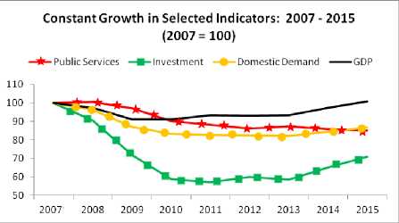
In constant terms (factoring in inflation) we find that the economy will probably exit the recession, sometime next year. [1] However, each of the main domestic components still remains in recession; that is, below their 2007 level. It has been the strength of net exports that has brought the economy back above the recessionary water-line, but as we will see below, there are considerable issues with measuring net exports. In this section I want to focus on two indicators: public services and investment.
|
|
(a) Public Services
By 2015, it is estimated that expenditure on public services will have fallen 15 percent below the recession levels. This expenditure represents collective consumption. The theory is that everyone contributes according to their means and receives according to their needs; that’s the theory, anyway. We know, though, that there are income groups at the higher end that have less reliance on collective consumption because they can purchase their goods and services on the private market – health, education, transport, pensions, etc. It is reasonable to assume that lower and middle income groups rely to a much a greater extent on collective consumption.
So a reduction in this key category represents a decline in supports – direct, indirect and in-kind – to groups who are unable to access private markets (not everyone can afford private hospital care, fee-paying schools, or a BMW).
But it gets worse. Collective consumption is falling back to below 2003 levels while GDP is 23 percent above 2003 levels. Public services are falling well behind overall economic growth (even more considering population growth). This squeeze will continue to put downward pressure on the living standards for most people for years to come.
The suppression of collective consumption will leave us lagging behind most other EU countries. [2]
|
Government Final Consumption per capita: 2013 (PPP) |
|
|---|---|
|
Netherlands |
9,415 |
|
Denmark |
9,020 |
|
Sweden |
8,867 |
|
Other EU15* |
6,863 |
|
UK |
6,559 |
|
Ireland |
5,773 |
|
Greece |
4,849 |
|
Portugal |
4,453 |
Ireland falls 16 percent behind the mean average of other EU-15 countries and even further behind the league leaders – Netherlands, Denmark and Sweden. It is interesting to note that our expenditure on public services is closer to Greece than to the average of other EU countries. That is both the damage that has been done to our public service infrastructure and the scale of the repair that will have to be done to bring us closer to our peer group in Europe.
(b) Public Investment
Ireland is undergoing a profound investment crisis. According to the IMF [3] Irish investment levels are (in 2013) 36 percent below the average of other Eurozone countries. They estimate that by 2019, we will still be 32 percent below average. A significant contributor to this is substantial reductions in public investment.
|
Public Investment (current prices) |
|
|---|---|
|
1999 |
2,891 |
|
2007 |
9,014 |
|
2013 Govt. Est. |
2,615 |
|
2018 Govt. Est. |
2,640 |
Investment in current prices (this doesn’t include inflation) are back at 1999 levels. And the Government is projecting that up to 2018, investment will rise marginally in current prices but when inflation is factored in, investment will fall by 15 percent.
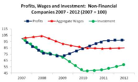
Here we compare aggregate wages and profits in the economy. Regarding the former, this is relatively straight-forward. However, measuring profits is not straightforward at all. This is due to the fact that Ireland acts as a tax haven-conduit; we are not a classical tax haven, a letterbox system that operates in places like the Cayman Islands (though there are some pretty empty offices in the IFSC). Rather, we facilitate the flow of profits through our corporate tax structure. This artificially inflates actual profit levels and, so, GDP. This affects other measurements; for instance, Forfas cannot use the gross value-added, which is related to profits, to measure productivity given what they charitably call the ‘accounting practices’ of multi-national companies. Therefore, they adjust by using US productivity in sectors dominated by multi-nationals, such as manufacturing (we must be one of the few countries in the world that has to use the productivity in other countries to measure our own).
Therefore, it is not safe to use these numbers when estimating actual profits generated in the economy. To adjust for this I used the Irish Fiscal Advisory Council’s hybrid GDP measurement. [4] They constructed this to measure our actual fiscal capacity and to provide a compromise between conflicting arguments over whether GDP or GNP is the best measurement to use. I assume the difference between GDP and the hybrid GDP to be the ‘fake’ profits that are imported from abroad to take advantage of our accommodative corporate tax regime. It is not wholly satisfactory but it provides a better approximation of reality. [5]
|
The usual pattern when an economy suffers a recession is that profits are the first hit while wage reduction usually lags. We can see this pattern above. Profits among non-financial companies fell by nearly 30 percent up to 2009 but since then they have nearly recovered to the prerecession level. Wage reductions lagged but have been on a downward trend and are still 15 percent below their pre-recession levels. Investment collapsed and despite increasing since 2010, investment is still over 40 percent below pre-recession levels.
Essentially, capital has restored profit levels at the expense of wages and investment.
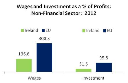
In comparison with the EU, Irish wages and profits lag well behind the EU average when measured against profits. While aggregate Irish wages slightly exceeds profits, in the EU wages are 300 percent higher than profits. Similarly with investment – in the EU, there is almost a one-for-one ratio of investment to profits; in Ireland, investment is less than a third of profits.
|
Concerning the non-financial sector (which includes all enterprises in the market economy excluding the financial sector), Ireland is a high-profit, low-wage, low-investment economy.
According to Professor Alan Ahearne, former special advisor to the Minister for Finance in the last government:
The economic recovery that is gathering momentum in Ireland is most visible in the labour market. Gains in employment averaged about 4,000 per month over the past year, corresponding to one of the fastest rates of job creation in Europe. [6]
Is this the case? Employment should be one of the more straight-forward categories to measure. The CSO’s Quarterly National Household Survey takes a ‘headcount’ of the number of people at work every quarter through a sample of the population. On this basis, the Government has claimed that 50,000, 60,000, 70,000 jobs have been created in the economy (depending on the Minister making the claim and the period they are referring to). No doubt, the headline figures presented by the CSO would seem to justify these claims. Nonetheless, these claims are flawed and the simple fact is that for a period of one year we don’t know how many jobs were created.
(a) Jobs Growth and Analytical Gymnastics
Following each census, the CSO revises their sample base to ensure that it coheres with the numbers produced by the census. This will lead to changes in the composition of employment and the numbers actually employed. Critically, they warned against ‘interpreting trends’ during this period of revision, or ‘realignment’ of their sample base. [7]
One could ignore the CSO’s warning – as Ministers and many commentators have done and pretend the revision makes no difference to employment growth, but to do so require us to believe that the laws of economic gravity have been suspended in Ireland. In 2012 employment actually fell by 11,000 – and this was after a loss of nearly 300,000 since the start of the crisis. However, in 2013 everything changed. Employment grew on a full-year basis by 43,000 (this is consistent with claims by the Government who were using quarter-to-quarter figures). [8] This was quite a turnaround. But there were some problems.
First, this employment growth took place while the economy remained in a domestic demand recession. Given that employment is sensitive to domestic demand, this didn’t make sense.
Second, the usual pattern of an economy coming out of a recession is that employment growth lags. This is because if there are increases in business output, the first beneficiaries are those already in employment; they get an increase in hours which had previously been cut.
Third, the actual job numbers were throwing up some strange happenings. Self-employment (own-account workers) grew by over 10 percent and made up over half of the total employment growth. At one stage, self-employment was growing by nearly four times the rate of growth during the boom. This, again, didn’t make sense – not with domestic demand stagnation. Agriculture employment showed a similar pattern.
So was employment growth largely statistical? A number of commentators said no; that the overall number was correct (a top-down survey); it was just the different categories that were being changed – such as manufacturing employment, or self-employment, or retail. However, the CSO constantly changes the overall number of people in work to keep it consistent with the Census – sometimes revising employment numbers in previous years. [9]
This revision occurred incrementally from quarter 4 2012 to quarter 4 2013. So what happened to job growth during these quarters?
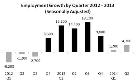
|
During the period of the revision, employment growth shot up. Before the revision period, employment was falling. After the revision employment growth was muted. This is strong evidence that employment growth in 2013 was inflated by the CSO’s statistical re-alignment but not conclusive. More evidence is needed – and this comes with a more stark comparison.
All manner of analytical gymnastics went into trying to explain this – because it is not readily explainable. In 2013, domestic demand falls and employment rises substantially. In 2014, domestic demand rises but employment grows sluggishly to the point of statistical insignificance. There is no sense in this that does not lead us back to the CSO warning against interpreting trends during the period of their sampling revision.
There are some other indicators. For instance, Forfas [10] reported that in 2013 employment growth in the internationally traded sector (export sector) increased by only 3,400 above the 2012 increase while among IDA supported companies [11], the rate of employment increase in 2013 fell below the 2012 level marginally. So these sectors could hardly explain the issue. And public sector employment didn’t contribute to any growth – it fell by over 6,000.
So where does that leave us? In a fog about the actual employment growth in 2013. It is probably the case that employment grew. It may have had a slight jump coming off a steep employment recession. But to make claims that run in the tens of thousands is not sustainable.
(b) Under-Employment
A feature of the labour market is the growth of under-employment. Underemployment is defined by the CSO as part-time workers who want to work more hours. Under-employment can be used as a proxy for precariousness though it doesn’t capture all aspects. For instance, at the time of the survey someone may be working full-time and, so, is not classified as underemployed. However, they may be on a short-term fixed contract with work ending soon and, quite possibly, unsure about when they may be able to obtain a subsequent contract.
Leaving aside this and other caveats, we find that over the period of the recession underemployment has increased by 42 percent, or 41,000. It should be noted that Ireland has the third highest-level of underemployment in the EU, behind Cyprus and Spain. [12] It can be legitimately argued that underemployment is a function of an economy coming out of a recession but still not capable of providing the hours that workers want (in a similar way that it cannot provide the employment). As economic growth becomes embedded, we should see a decline in this category.
Maybe. Underemployment is an instrument of control over the workforce, a union-avoidance device used by employers. Low-hour contracts are used not only to maximise labour flexibility (on capital’s terms, not labour’s) at firm level, it also allows employers to reward employee quietude and penalise employee activism. If an employee is suspected of being a union member, or is urging other members to join a union, or makes a health and safety complaint, or is reluctant to work unsocial hours – they can be penalised with lower hours in the following weeks and months. The ‘good’ employee (one who keeps their head down and suffers everything the employer throws at him or her) is rewarded with extra hours.
We will have to wait and see to what extent underemployment becomes embedded in the labour market. As employment rises, employers may find it difficult to retain employees on such terms. Increasing staff turnover and associated costs may limit and even depress underemployment. Nonetheless, it is a phenomenon occurring now and a tactic which employers may deem worth the cost.
(c) A Middle-Class Recession?
At the beginning of the downturn there was an attempt to claim this as a ‘middle-class’ recession. [13] Whatever about the (considerable) confusion by some (many) commentators as to what middle-class means, this cannot be called a recession for managers and professionals. We have to be cautious about using CSO headline employment numbers – specifically those occurring in 2013. So this should be treated as indicative.
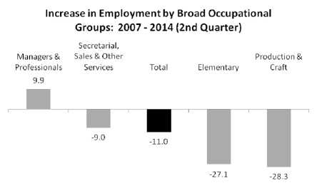
|
Employment has fallen by 11 percent over the course of the recession. However, managers and professionals bucked this trend with employment increasing by 10 percent. [14] In all categories – in particular production and craft, and elementary occupations being the hardest hit (the latter makes up both service and production workers).
This has been a working class recession hitting, especially, manual workers.
(d) Employment by Sector
If the magnitude of job creation is suspect, it may be possible to assess where jobs are being created. We have to be mindful, though, that the revision of the CSO’s sampling base may have affected the sectoral distribution of employment. As an exercise, let’s see where jobs may have been created.
|
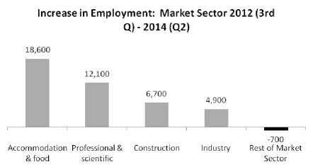
The biggest proportion of the employment increase has occurred in the hospitality sector (hotels and restaurants) – comprising 44 percent of all jobs growth. This shouldn’t be surprising – the Government has thrown considerable resources at the sector through the reduction in the VAT rate and employers’ social insurance for low-paid workers (though this latter has been reversed as it was only intended as a temporary measure under the Jobs Initiative). It should be noted that this was something an Irish government couldn’t do given that we are a small open economy; that is, provide stimulus for economic activity. Other sectors lag with nearly half of all sectors combined experiencing a small decrease (this includes the retail, financial, information, transport and administrative sectors).
What we find, if this sectoral distribution holds, is an uneven employment recovery with the leading sector being the lowest-waged and lowest valued-added; namely, the hospitality sector.
There is no question that unemployment has fallen. Having risen from 105,000 in 2007, it peaked at the beginning of 2012 at 326,000 and has undergone a steady decline since. What has driven this fall in unemployment? One cannot automatically assume that rising employment is the principal cause – especially as employment growth trends are suspect. A return to education, or staying in education, can cause unemployment to fall. Leaving the labour force can be another factor – workers who are discouraged after years of searching for work.
It can be difficult to disentangle these effects. But there is one contribution to falling unemployment we can measure: emigration. There is no question that emigration has been a ‘release valve’ when the Irish economy has been unable to produce sufficient jobs for the labour force. Back in the late 1980s, unemployment stabilised but this wasn’t due to jobs growth. Between 1987 and 1991, unemployment fell by 33,000 while employment grew by 66,000. And during this period over a quarter of a million left the country. Emigration played a major role in the reduction of unemployment.
And so it is today. While we only have annual emigration estimates, we can assume a linear quarterly breakdown which provides an adequate approximation. We also need a base-line to measure what can be called ‘recession-related emigration’ among the working age population. We establish this by taking the average emigration between 2000 and 2007 and assume no economic pressure to emigrate as the economy was near full-employment. In subsequent years, emigration above that baseline is considered ‘recession-related’. [15]
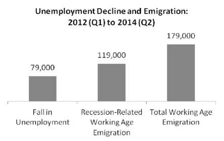
|
We find that while unemployment fell by 79,000 from its peak, during this period the estimated number of recession-related working age emigration was 119,000 with total working age emigration at 179,000.
To put the emigration in perspective, since 2007 total working age emigration has been a staggering 488,000 with 61 percent of that number estimated to be recession-related.
Clearly, were it not for emigration the numbers on the Live Register would be substantially higher with considerable increased pressure on public finances – which no doubt would have entailed further fiscal contraction. Once again, emigration has solved a number of problems that the Irish economy and the Irish Government couldn’t or wouldn’t attempt to resolve.
As we saw above, aggregate wages make up a small proportion of non-financial profits in comparison with the EU; and, though, growth is still lagging behind profit growth. In this section we look at how any wage growth is being distributed.
Since 2008 average weekly employee income has fallen by 3 percent, though average hourly earnings has increased marginally. We should note that a composition effect may distort these averages somewhat. As we saw above, managers and professionals saw an increase in employment while elementary occupations suffered a decline. Therefore, over this period the composition of the workforce contains additional higher earning employees, thus affecting the average.
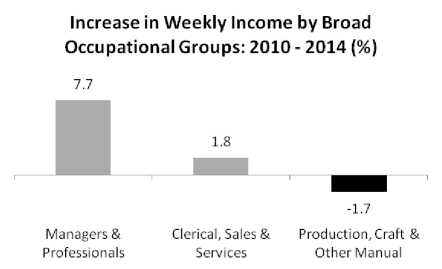
We can get a breakdown of this according to broad occupational groups. Unfortunately, this data only goes back to 2010 in the form of weekly income. [16]
Managers and professionals experienced significant weekly income growth. We should be careful to note that this doesn’t mean that employees in this category experienced an increase; this is just an average and can be affected by compositional changes. Nonetheless, as a group, their income has risen. This is in contrast to both white and blue-collar workers who have seen their weekly incomes stagnate.
|
It should be worth noting that the tax reductions in Budget 2015 provided the highest level of nominal gains to higher earners. Therefore, these high-income groups have received a double boost: first, from the market (through weekly income increases); and, second, from the tax reductions.
Let us pause here to summarise our findings above.
This is the kind of economy we’re creating – privileging capital, reducing the public realm with a significant cost to workers’ employment and wages, forcing a considerable number to emigrate.
Now we turn to the question as to what extent we are actually experiencing a recovery.
Normally, reading an economy – at least at the macroeconomic level – is a pretty straight-forward exercise. You estimate growth in main expenditure categories such as personal and Government consumption (expenditure on public services), investment and net exports (exports minus imports). You add all this together (factoring in inflation) and you have a very general look at how an economy is performing. Is it growing? Is it in decline? Is it stagnating?
And then there’s the Irish economy. Many of these indicators seem to be sharply increasing – with claims that we now have the fastest growing economy in the EU. But it’s hard to disagree with the ESRI’s Dr. John Fitzgerald when he wrote [17]:
... the standard EU harmonised national accounts are not a satisfactory framework for understanding what is happening in the Irish economy.
This is primarily, but not exclusively due to the impact of multi-nationals and the IFSC which can give a false reading of headline. Let’s go through some of these categories and see how reliable they are. The question here is – are we actually in recovery?
Multi-nationals and the GDP: Everyone knows that GDP is not the best measurement of the Irish economy. But it’s not just because multi-nationals make profits here and then repatriate them (that is, take out of the country). Profits in Irish manufacturing – measured as profits per employee – are nearly eight times that of other EU-15 countries; in the Information and communication sector, it is over three times. Clearly, these are not profits generated by employees in Ireland; they are generated in other economies and ‘imported’ here to take advantage of our low tax rate and our position in the global tax-avoidance chain. The point here is that our GDP is distorted by multi-national profit-shifting – and that’s before you start taking account profit-repatriation.
Using GNP: This isn’t a satisfactory measurement either. GNP is just the GDP after you take account of money flowing in and out of the country (and more money leaves Ireland than comes in). The ESRI uncovered a real problem in all this: they found that re-domiciled multi-national profits are artificially boosting GNP but have no impact on the real economy. This can count in billions (in 2012, it was €7.5 billion or 5 percent of GNP). [18] Therefore, when you see a GNP figure you have to ask yourself – how much of this is real, temporary and just plain illusory.
The IFSC: Activity in the IFSC can also boost growth numbers – but these are just so many empty calories. Here’s what the Central Bank had to say about this in their first quarterly report this year [19]:
Financial sector developments, which are for the most part unrelated to the domestic economy, account for a significant portion of the rise in GNP ... they would further support GNP growth unrelated to domestic consumption, investment or export activity.
Here, again, we see the profit flows and profit retentions impacting on the GNP but with little impact on the real economy.
New Basis for Calculating Exports: Again, the Central Bank directs us to another, even stranger, anomaly. [20] As a result of methodological changes in compiling the National Accounts (the GDP and GNP figures):
... goods owned by an Irish entity that are manufactured in and shipped from a foreign country are now recorded as Irish exports.
Goods that are manufactured in a foreign country and exported from that country, are now counted as ‘Irish exports’ if the goods are owned by an ‘Irish entity’. While this might include some domestic companies, it is no doubt dominated by foreign multi-nationals which are registered as a company here.
This has led to a sharp rise in exports earlier this year – with the Central Bank, the ESRI and even the Department of Finance warning against too much credibility in this. Given that the recent upswing in GDP is primarily export-driven, this puts into focus the issue of just how much our growth is statistical, rather than real.
Government consumption: This is the same as expenditure on public services. In normal times, this shouldn’t be a problem measuring. However, there is a once-off quirk that affected positively growth figures earlier this year [21]:
Government consumption growth in the first half of 2014 (at 5.3 per cent) was particularly strong. This is largely a statistical effect due to the effect of longer hours worked under the Haddington Road Agreement.
What this tells us that a part of the overall growth figures have been informed by a statistical effect.
GDP, GNP, exports, IFSC activity, and government consumption – all have been impacted by statistical effects. Is there a measurement that can give us a better picture of what is happening in the overall economy? Yes, domestic demand – which is comprised of consumer spending, expenditure on public services and investment. This makes up about 75 percent of the total economy – the remainder coming from net exports. This comes with the government consumption caveat above (though the effect is once-off and relatively small) and potential quarterly volatility in investment where aircraft purchases are involved. With this in mind, let’s look at what has actually happened to domestic demand- with data up to the second quarter this year. [22]
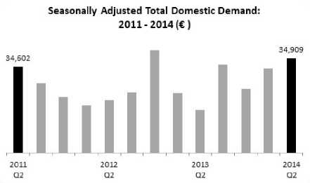
|
When the Government entered office, domestic demand stood at €34.6 billion. Three years later it stood at €34.9 billion. We are back to where we started. In the first six months of this year domestic demand increased by 3.3 percent – a strong half-year performance. So what accounts for this rise in the last two quarters?
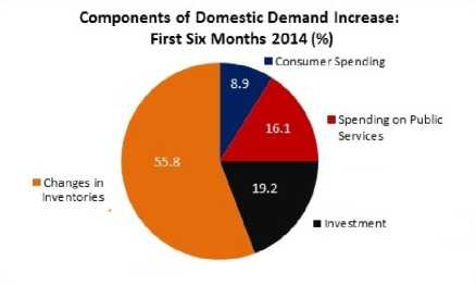
|
The main driver was the change in inventories – the value of goods that have not been sold yet or have been purchased by businesses but not yet used in production. This is usually a tiny category in the overall economy but in quarterly statistics it can have an impact. The one bright spot about this is that business may be stocking up in anticipation of future sales; if you don’t have confidence in the future you don’t increase your inventory. But businesses are not necessarily the best seers.
The next biggest contributor was investment. This is a little more hopeful. The Central Bank believes this investment will grow substantially over the next two years, with construction making up nearly half of this growth – understandable after years of depressed building activity.
We may be seeing a burst of business investment after years of postponed demand. Now that the future looks a little bit better, there is a flurry of activity. We’ll have to see if this activity continues over the long term – though the Central Bank estimates that investment growth will start to ease in 2015.
Hard to tell, given that our headline numbers are compromised by multi-national and IFSC activities, and new accounting methods. Domestic demand – a reasonably reliable measurement – has increased in the first half of the year but this was largely driven by changes in inventories.
And despite a flurry of investment activities – which may be relatively shortlived – we are still far behind our EU partners. We are still facing into a long-term investment crisis.
Is this clear as mud? Yes – because so many of our measurements are mud.
After all this we can get a glimpse of the future – the privileging of profit, the continued suppression of wages for most people, a falling unemployment rate that is flattered by rising emigration and a set of indicators which are permeated with statistical anomalies. No doubt we will continue to be reassured that all that fiscal pain over the last few years was necessary and ultimately successful. And if the pain continues to be felt – well, our elites will have the balm of arithmetic sleight-of-hands to assure us that this how the world is and has to be.
And this will give rise to a new acronym: TINAF. There is no alternative future. The job of progressives and trade unionists is to ensure that this dismal acronym does not gain traction.
1. CSO, National Accounts for data up to 2013; Central Bank Quarterly Bulletin, 2014, 4th quarter for 2014 and 2015 estimates.
2. EU Ameco Database: Government consumption expenditure; and Eurostat: Purchasing Power Parities.
3. IMF, World Economic Database, April 2014.
4. The IFAC’s formula is to take 40 percent of the difference between GDP and GNP and add it to the latter.
5. Eurostat: Non-Financial Transactions.
6. The economic recovery is most visible in the labour market, Irish Times, 9 August 2014.
7. After each Census of Population the sample of households for the QNHS is updated to ensure the sample remains representative. The new sample based on 2011 Census of Population will be introduced incrementally from Q4 2012 to Q4 2013. This change in sample can lead to some level of variability in estimates, particularly at more detailed levels and some caution is warranted in the interpretation of trends over the period of its introduction.
CSO, Quarterly National Household Survey, 4th Quarter 2012. This was repeated in the following three releases.
8. CSO, Quarterly National Household Survey, 2nd Quarter, 2014.
9. CSO, Revisions to labour market estimates, November 2012.
10. Forfas, Annual Employment Survey, 2013.
11. IDA, Annual Report, 2013.
12. Eurostat: Underemployment and potential additional labour force statistics, 2014.
13. Here is but one of many examples of this flawed description:
This is Ireland’s first middle class recession – which is why it is going to be a deep one. The middle class is the economic, cultural and moral backbone of any nation. They also pay most of the taxes.
Gerard O’Neill: A Middle-Class Recession, Turbulence Ahead Blog.
14. CSO, Quarterly National Household Survey, 2nd quarter 2013.
15. CSO Database: Estimated Population Migration by Age Group, Sex, Origin or Destination and Year.
16. CSO Database: Estimates of Earnings Per Week by Industry Sector NACE Rev 2, Type of Employee and Quarter.
17. ESRI, Quarterly Economic Commentary, Spring 2014.
18. Dr.John Fitzgerald, The Effect of Redomiciled Plcs on GNP and the Irish Balance of Payments, ESRI Research Note, Spring 2013
19. Central Bank, Quarterly Bulletin, 1st quarter 2014.
20. Central Bank, Quarterly Bulletin, 4th quarter 2014.
21. Department of Finance, Budget 2015: Full Report.
22. CSO: Quarterly National Accounts, 2nd quarter 2014.
IMR Index | Main Newspaper Index
Encyclopedia of Trotskyism | Marxists’ Internet Archive
Last updated on 22 September 2020